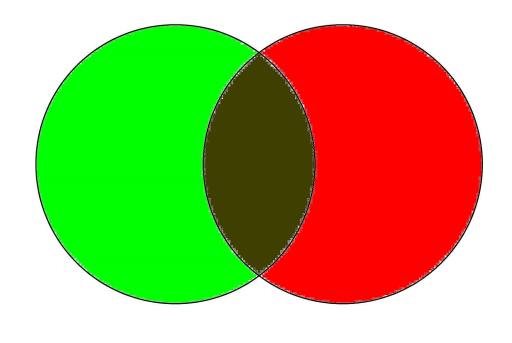
Green is the secondary shade formed from the basic hues yellow and blue. You may simply introduce new shades to green when blending color to get diverse color effects. What do green and red make? And How many colors can you make with green?
Our post today will help you answer that. We’ve also included a color mixing guideline to help you master the art of colors. So dig in for more information.
Table of Contents
6 Beautiful Color Combinations With Green
What Color Do Green And Red Make? Brown
When red and green are combined, they invariably give brown tones. This occurs since red and green are opposed hues.
The tint of brown you make may seem more reddish or greenish due to how much red is mixed with green.
Mixing a lot of red, for instance, results in a brown with a noticeable reddish undertone. If green is added to orange or violet, the effects are in accordance.

Green And Blue: Cyan
If we combine blue and green, we’ll achieve the color Cyan in different shades.
The final result depends on the amount of each color in the combination. For example, when blue is the primary shade, the outcome takes on a greenish tinge. On the other hand, when green is the primary shade, it takes on a blueish hue.
Mixing Yellow And Green: Yellowish Green And Greenish Yellow
Yellow and green make yellowish-green and greenish-yellow in different tones. Similar to the combos above, the outcome mainly relies on how much each color is used when mixed.

For example, if you combine extra yellow to green, the final shade is more yellowish with a slight greenish tinge and vice versa.
Pink Plus Green: Gray And Brown!
What color do pink and green make? Brown or gray. All complimentary shades, like blue, orange, yellow, and purple, produce the same outcome when mixed.
Yet, based on how the shades green and pink are mixed, you could receive a few variations of brown and gray. For example, if you select neon green, you will have a considerably bolder color. However, if light, pastel green is what you choose, the resulting color will be more grayish or whitish.
White Combined Green: Pastel Green
If white is mixed with green, it produces a paler, pastel color.
Therefore, if you simply use a tiny bit of white, your color will only brighten minimally. However, if you use a lot of white, your color might brighten drastically and seem primarily white with a greenish tinge.
What Happened If We Mix Black And Green? Darker Green
When black is mixed with green, it produces a deeper version of green. If a lot of black is mixed in, the green blackens drastically. However, if only a tiny bit of green is applied, the color barely blackens.
Further reading
- Following A “Work-Life” Balance, Where Do Flies Go At Night?
- Can You Donate Plasma If You Have Herpes And Other STDs?
- Butter Is Not A Carb, But How Many Calories Are In A Stick Of Butter?
Color Mixing Guide: How To Create The Color You Want
Learn The Color Theory
Mastering the 3 primary shades is the fundamental step in color blending. And if you’re into painting, you’ve probably heard of primary hues and their significance. But first, let’s get into the color theory to ensure that you’re familiar with the color system.
Primary Colors
Red, blue, and yellow are the 3 primary hues, and combos of such shades can produce a wide array of different colors.
You’ll always want basic shades since you won’t be able to create them on your own. Although the concept is straightforward, the main colors come in many tinges.
When purchasing your first painting kit, select 2 tones of every basic shade — one in a warmer tone and the other in a cooler tone. The below painting colors are advisable for acquiring the best color-mixing chart:
- Cadmium red (A warm-toned red with a tinge of yellowish)
- Alizarin crimson (A cool-toned red with a tinge of blueish)
- Lemon yellow (A cool-toned yellow with a tinge of blueish)
- Cadmium yellow (A warm-toned yellow with a tinge of reddish)
- Phthalo blue (A cool-toned blue with a tinge of yellowish)
- Ultramarine blue (A warm-toned blue with a tinge of reddish)
Getting 2 separate tones of every basic color allows you to blend secondary and tertiary hues effortlessly. You might achieve your desired shade using less work and have more shades to work with.
You may blend a more extensive scope of hues by possessing varied intensities of every primary color. For instance, you may create multiple degrees of green by combining multiple yellows and blues.
Secondary Colors
Once you’ve mastered the basic shades, you may combine them to produce secondary hues. For example, when 2 main colors are mixed, a secondary shade is created. The secondary shades are orange, green, and purple.
If you blend colors from this group, you may get a wide range of colors and intensities. The final results vary depending on the amount of each shade you apply, which dominant color you utilize, and the intensity of those colors.
Tertiary Colors
Tertiary colors are just versions of secondary shades, put simply. However, combining secondary colors in various proportions and intensities may create a more extensive scope of colors known as tertiary shades.
Tertiary shades are excellent for developing a more complex color spectrum and better transition from one shade to another.
As you blend secondary shades, you may make 6 new tertiary hues. All of these may be customized to get a larger spectrum of colors. The tertiary colors are as follows:
- Red-orange
- Blue-green
- Blue-purple
- Red-purple
- Yellow-orange
- Yellow-green
When studying how to combine colors, you will notice that every shade is connected to the others and comes from the original fundamental colors. Therefore, 3 basic shades are the only things you need to get a far larger spectrum of hues.
Grasp The Color Wheel
When you first begin combining colors, you may frequently come across the color wheel. A color wheel is a form of a definite color-mixing diagram that could assist people in grasping the multiple color connections. It could also help you quickly select which hues to employ while blending different hues.
Complementary Colors
The color wheel shows colors lying opposing one another. The pairs of colors which are opposite to one another are complementary hues. As the term says, whenever these shades are applied side by side, they complement each other and create a stronger effect.
When it comes to complimentary hues, yellow with purple come hand in hand, blue and orange work well together, and red and green make one another better.
At the same time, we also have split-complementary hues. This is the same concept, except instead of utilizing the opposing shades, it employs the colors closely neighboring them, offering a similar effect as complementary colors but with greater diversity.
Analogous Colors
To find analogous shades, simply search for the 3 hues adjacent to one another on the color wheel. Then, quickly pick any section on your color wheel, and the 3 hues sitting next to one another will be analogous. These are strongly linked hues, so they look great when paired together.
Triadic Colors
You could easily identify triadic colors by looking at the picture above. If utilized correctly, you receive a colorful combination that is both vivid and vibrant. For instance, orange, green, and purple are triadic hues that combine beautifully to create a stunning look.
Experiment Is The Key
Here is a helpful tip: practicing and experimenting are the only ways to master painting truly.
When it comes to color blending, you’ll have to invest a lot of effort experimenting with multiple proportions and mixtures until you have a good knowledge of every color. Once you’ve established a solid foundation, combining painting colors of any hue will become a breeze.
We’ve picked 4 terrific strategies to assist you in achieving the ultimate skill of color blending. These practicing tasks will develop a solid grasp of color theory and blending.
Initiating Color Gradations
When looking at the color wheel, you will notice vivid hues made of primary and secondary shades. In detail, brown, neutral, and grey are mixed shades blended from primary colors.
Color gradation describes the process of transitioning from any complementary hue to the other, with all mixed shades in between.
Make a line with 7 panels to begin practicing color gradations. Then, fill the farthest left panel with a red-orange hue and the farthest right panel with a blue color. Finally, work your way through the complex shades to go from one hue to another.
Before moving to the next practice, ensure that you have mixed enough shades. Then, practice creating the proper gradation, beginning with the red-orange and deepening it a little at a time.
The shades should transition from warmer to cooler tones, featuring the neutral area in the middle. This is difficult to master, so it might take several self-training sessions.
Check out this grid paper for easier practice:
Experimenting With Tones
Tone represents the degree of brightness or darkness in a specific hue.
To master tone, begin by making a line with black on an endpoint and white on another to discover a shade’s different tones. Then, build the various tonal stages to transition from one shade to another.
When you’ve mastered black and white, repeat the process with every other shade of your preference. You could practice building a tonal spectrum using acrylics because you could brighten the colors with only water. Likewise, white could brighten oil colors, acrylic colors, and watercolors.
This practice follows the same steps as the hue gradation task mentioned earlier. To go from one color to another, draw a line with 7 panels, introducing a tiny white to a specific color. Remember, precise transitions are difficult to obtain, so this will take some work.
Below are a few acrylics, oil colors, and watercolors recommendations:
Color Matching
Mastering the technique of color matching may be pretty beneficial in creative arts. Color matching is an entertaining yet challenging practice. You may accomplish this by cutting out 6 or even more pieces of various shades from a periodical.
Put those pieces on paper and create a blank panel next to each one. Afterward, in the blank panel, attempt to replicate the identical shade as the hue beside it. Doing this exercise can help you develop a strong understanding of blending colors.
Saturation and Contrast
It is critical to understand how to utilize shades to provide levels of dimension to artworks. First, create a row of empty panels to begin this practice. Then, to provide extra style, use two complementary hues in different tones.
The focal point of this exercise is to highlight the application of bright and vivid shades. Afterward, with complementary hues, you may build degrees of saturation and contrast. Tone contrasts created by using cool shades are essential for initiating a sense in an artwork.
A smart method to master this is to make one complimentary hue the leading element in the artwork. Then, you could utilize these different shades to provide additional visual blasts, emphases, or spots of focus.
When 2 brilliant complementary colors are placed directly side by side, they immediately catch the eye. Simply practice this to gain a sense of how to use colors.
Wrapping Up
Hopefully, now you have your answer to the question, “What do green and red make?” With a secondary color like green, you can create many different shades and new colors. All you have to do is to grasp the basics and keep practicing.
Other far-out science-related posts are available on Science category and our website Jobandedu.
Note: This blog contains relevant Amazon products that we earn a small commission to fund our blog while not incurring any extra cost to you.
